Gesa Single Product Dashboard
Driving end-to-end design for a mobile app's single card dashboard experience to ship a solution that reduced mobile app related call center volume by ~15%.
Role
Product Designer
Team
Design Systems + Mobile
Company
Gesa Credit Union

Background:
Following Gesa Credit Union's merger with Inspirus, the organization undertook a company-wide rebrand with a mandate to broaden its appeal and modernize its digital experience. The legacy mobile app had accumulated significant usability debt which was reflected in poor user reviews and elevated call center volume.
I led end-to-end design for the mobile app's single product dashboard experience, navigating competing stakeholder priorities to ship a solution that reduced mobile app related call center volume by ~15%.
The Challenge
The old app overwhelmed users by surfacing too many products and actions simultaneously, making it difficult to accomplish basic tasks. At the same time, internal teams were competing for dashboard visibility, creating pressure to show everything at once (a pattern that's frustrating to users)


The Approach
Faced with an ambitious launch timeline and an ambiguous success target, we defined a phased strategy centered on incremental, measurable impact. The key design decision was a single-product dashboard model: after login, users select the product they want to manage — a debit card, credit card, auto loan, etc. and land on a focused view showing only the actions and information relevant to that product.
This architecture resolved the stakeholder tension by creating structured, intentional moments for cross-selling other products within the dashboard, rather than competing for a single shared space.
The redesign also prioritized features users explicitly wanted but the legacy app lacked, including biometric authentication (face recognition), which we championed with the engineering team as a foundational trust and usability improvement.


Reflections & looking forward
Launching within the constraints of a rebrand meant moving faster than a traditional user testing cadence would allow. Now that users have had time to acclimate to the new experience, there's a clear opportunity to run structured usability testing across dashboard iterations to better understand which features matter most and use those findings to sharpen future prioritization.
There's also room to grow the app's cross-sell potential. The single-product model created natural moments to surface relevant products, and expanding those placements alongside smarter in-app alerts triggered by account activity or life events could deepen engagement while keeping the experience feeling genuinely useful rather than promotional.
Other projects

Discover Card Rewards Mobile App Dashboard
Driving quarterly activation and share of wallet through new dashboard components — testing where, when, and how cardmembers act inside the app.

Discover Card 5% Rewards
Designing the activation-to-spend journey for Discover's rotating 5% categories — lifting activation by up to 24.2%, driving a 7% average lift in category spend, and building cardmember loyalty along the way.
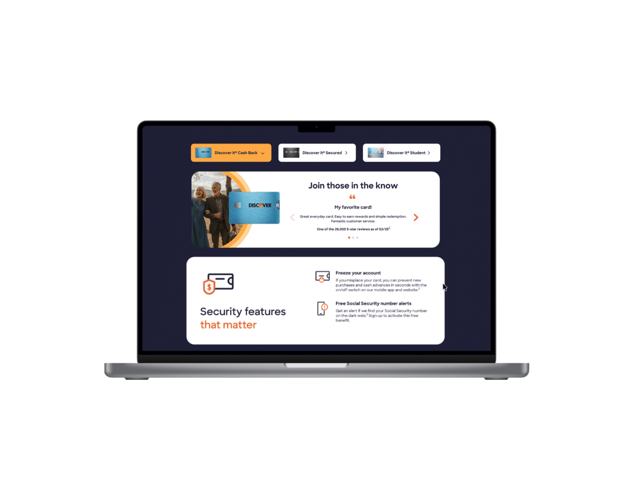
Discover Card Testimonials
Achieving a 6% conversion lift in card applications via a multi-card testimonials component + improving SEO ranking through increased user engagement.

Discover: Tap to Ride
Boosting contactless payment adoption + 20% lift in contactless card transactions among MTA transit commuters.