Discover: Tap to Ride
Boosting contactless payment adoption + 20% lift in contactless card transactions among MTA transit commuters.
Role
Visual/Marketing UX Designer
Team
Card Payments + Marketing
Company
Discover/MTA

The brief:
Despite Discover's contactless payment capability being available across its card, phone, and wearable ecosystem, adoption among everyday transit commuters remained low.
As part of the internal agency at Discover Financial Services, I was tasked with creating a campaign that shows how easy it is to pay on the Discover Global Network and to drive greater adoption for contactless payments. Our team set out to make it impossible to ignore, and impossible to forget.
4M+
NYC MTA daily riders
80%+
Recall rate for transit ads in the NYC metro translating to Discover brand lift
300+
Total print and digital assets produced
Research + consumer mapping:
Mapping within the MTA environment was central to the research phase. The goal was to understand where people were on the transit system and how ads could interrupt their payment habits, trigger awareness, and drive recall at the point of payment.


Design iterations
Single-device focus
Early concepts centered on the physical Discover card alone. While clean and on-brand, testing revealed that limiting the visual to one payment method undersold the flexibility of the network.
Multi-device visual system
The creative pivoted to showcase all three payment vectors — card, smartphone, and wearable — each featured as a hero across its own panel. The concentric ring "tap signal" graphic was introduced to visually communicate the wireless transaction, tying each device to the same gesture and the same brand moment.
300+ assets, one coherent language
The final campaign delivered a modular asset system in Discover's navy and orange, making it flexible across every MTA format while maintaining visual consistency. Each execution communicated the same idea: just "tap to pay".


Takeaway and outcome:
The most effective UX solution wasn't in the app or website, but in the environment itself. Meeting users at the exact moment of behavior change, with a message stripped to its simplest form, created the clearest path from awareness to action.
20% lift
→ Increase in contactless transactions across the MTA YTD (2024).
4M+ daily
→ Commuters reached within NYC's highest-traffic transit environments.
Other projects

Discover Card Rewards Mobile App Dashboard
Driving quarterly activation and share of wallet through new dashboard components — testing where, when, and how cardmembers act inside the app.

Discover Card 5% Rewards
Designing the activation-to-spend journey for Discover's rotating 5% categories — lifting activation by up to 24.2%, driving a 7% average lift in category spend, and building cardmember loyalty along the way.

Gesa Single Product Dashboard
Driving end-to-end design for a mobile app's single card dashboard experience to ship a solution that reduced mobile app related call center volume by ~15%.
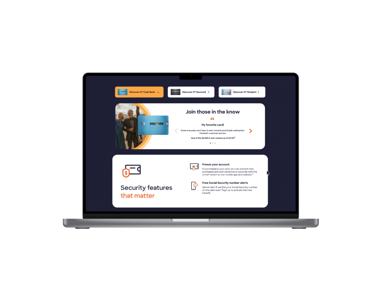
Discover Card Testimonials
Achieving a 6% conversion lift in card applications via a multi-card testimonials component + improving SEO ranking through increased user engagement.