Discover Card Rewards Mobile App Dashboard
Redesigning the rewards dashboard through segment-based A/B tests — using behavioral cohorts to personalize above-the-fold content and lift quarterly activation and spend.
Role
Product Designer
Team
Mobile + Rewards (Growth)
Company
Discover
The problem
Discover's 5% Cashback card rotates bonus categories every quarter, and cardholders have to activate each one to earn. Engagement resets every 90 days. The business needed three things at once: more activations, more spend in active categories, and top-of-wallet habit. All three feed the same funnel, so I treated them as one problem.
The strategy
Categories were announced just a month out, and spend patterns shifted with every rotation, so no quarter could predict the next. Behavior was the stable layer. I segmented cardmembers by what they did (lapsed, active, never activated, new, student) rather than what the quarter was, then designed a targeted component for each segment and moment in the cycle.


What I tested
Where to earn 5% — connects the activated category to actual merchants. Lapsed + never activated, in-quarter.
Digital wallet prompt — sets Discover as the wallet default right after activation, removing friction at the point of purchase.
Urgency + reward — how much of the $75 is left to earn as the quarter closes. All activated.
Second activation entry point — a bottom-of-flow activation card that catches intent the top carousel missed. Lapsed + never activated, pre-quarter.

Results
Activation was measured per channel, so in-app and email tests could each be read cleanly — these results reflect the dashboard alone.
→ Second activation entry point: 7% activation lift, 6% lift in overall spend (Q3 2024)
→ Where to earn 5%: 5% incremental spend, 6% overall spend lift (Q2 2024)
→ Digital wallet: 3% Apple Pay enrollment lift in tested segments
→ Urgency + reward: isolated testing in progress
The insight
The horizontal carousel was quietly suppressing activation. Cardmembers swiped past the one card that mattered. Placing a second activation card in the vertical flow, after browsing intent had built, produced the strongest lift of any test. Behavioral segmentation is what made every result measurable: each component could be A/B tested against the exact segment it was built for.
Other projects

Discover Card 5% Rewards
Designing the activation-to-spend journey for Discover's rotating 5% categories — lifting activation by up to 24.2%, driving a 7% average lift in category spend, and building cardmember loyalty along the way.

Gesa CU Loan Application Flow
Rebuilding Gesa's mobile credit card application around drop-off research: one shared structure for every lending product, built to grow lending by losing fewer applicants.

Gesa Single Product Dashboard
Driving end-to-end design for a mobile app's single card dashboard experience to ship a solution that reduced mobile app related call center volume by ~15%.
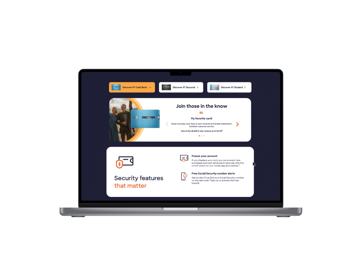
Discover Card Testimonials
Achieving a 6% conversion lift in card applications via a multi-card testimonials component + improving SEO ranking through increased user engagement.