Gesa CU Loan Application Flow
Rebuilding Gesa's mobile credit card application around drop-off research: one shared structure for every lending product, built to grow lending by losing fewer applicants.
Role
End-to-end, Senior Designer
Team
Acquisition
Company
Gesa CU

Background
Gesa Credit Union had just merged with Inspirus and rolled out a new brand — but its mobile lending applications hadn't come along. Credit card, auto, and personal loan flows still lived in the old visual system, each built separately, and next to the rebranded experience everywhere else they read like a different company. Drop-off was high across all three, with auto loans worst, credit cards close behind.
Research: where and why people quit
Working with an external research agency, and our analysts, we analyzed drop-off across Gesa's lending products. Three findings shaped the whole project:
Abandonment was high across lending products, with higher drop-off rates on mobile.
Mobile was both the preferred surface and the worst performing — younger members overwhelmingly applied on mobile, and mobile flows had higher drop-off than desktop. So the product's growth audience was applying in its worst-performing channel.
Time was the enemy: the longer an application took, the more likely it was abandoned.


Diagnosis: the specific failure points on the old flow
Drop-off concentrated on screens with too many fields and extensive vertical scroll. The old application also had no progress indicators — members had no sense of how much was left — and saving required scrolling to the bottom of the page, so pausing was itself a chore.
How I implemented user feedback and research findings:
→ less vertical scroll, shorter screens, grouped steps
→ ID capture pre-fills member info, with manual entry as fallback
→ progress bar with estimated time to finish, and estimated time at the start of the application flow
→ sticky save button, always reachable, so coming back to the application is easy if user's progress is interrupted (email collected early in the flow)
→ up-front checklist of what to grab before starting — progressive disclosure that front-loads expectations
→ warm tone, simple language throughout to reduce cognitive load and build trust
→ micro animations to drive brand recognition + delight

Scaling the flow across other products
I treated the credit card application as the proving ground for a shared framework: it's the lending product with more options and nuance, so a pattern that held there would hold across personal and auto loans.
Scope and handoff
I left Gesa for a new role before the framework could be measured in the wild, so this case study ends without the numbers I'd most want to show. The measurement plan I handed off: heatmapping to see where members hesitated inside each screen, drop-off tracking with our analysts to compare abandonment against the old flow at each step, and only then CTA-level testing.
Other projects
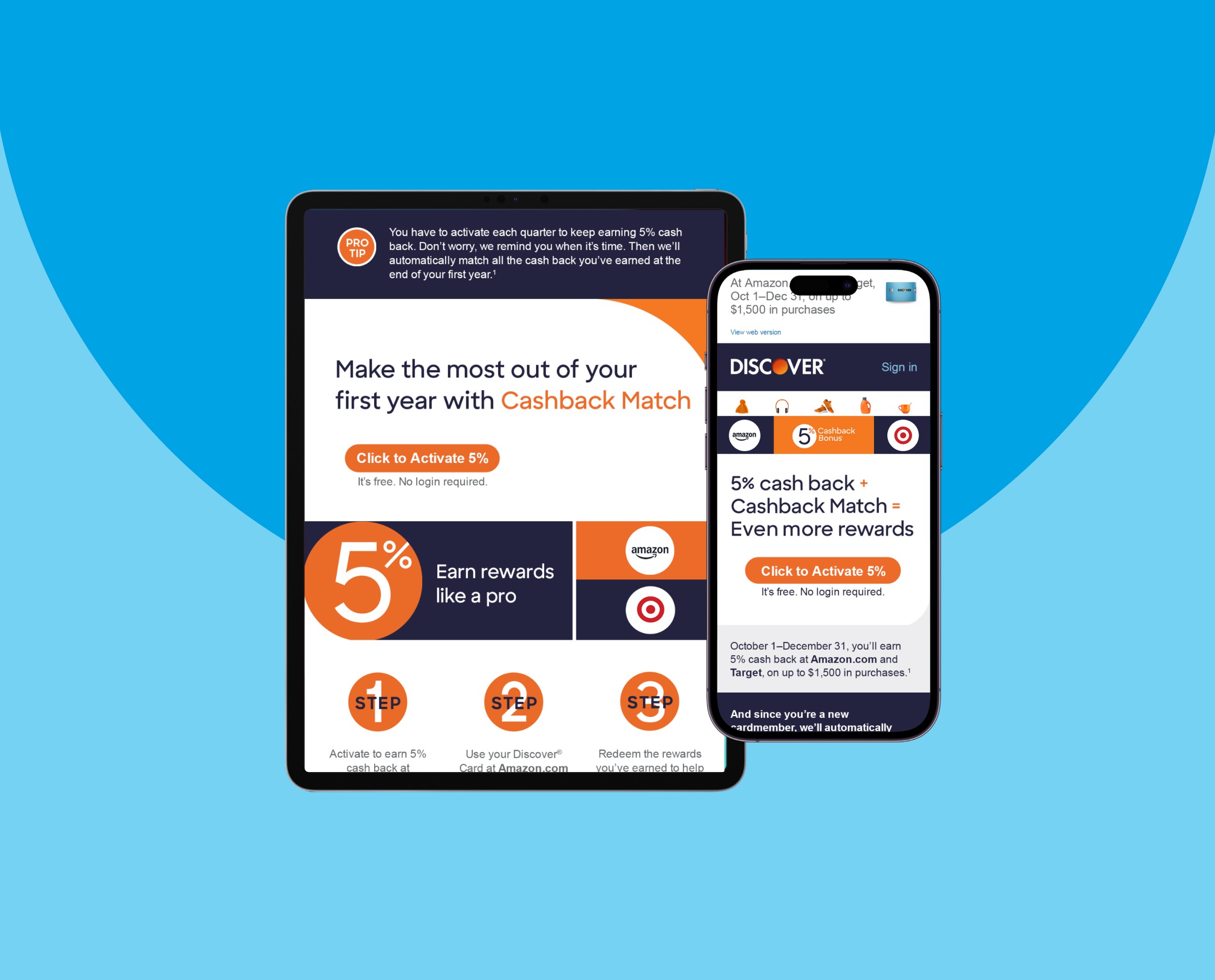
Discover Card 5% Rewards
Designing the activation-to-spend journey for Discover's rotating 5% categories — lifting activation by up to 24.2%, driving a 7% average lift in category spend, and building cardmember loyalty along the way.

Discover Card Rewards Mobile App Dashboard
Redesigning the rewards dashboard through segment-based A/B tests — using behavioral cohorts to personalize above-the-fold content and lift quarterly activation and spend.
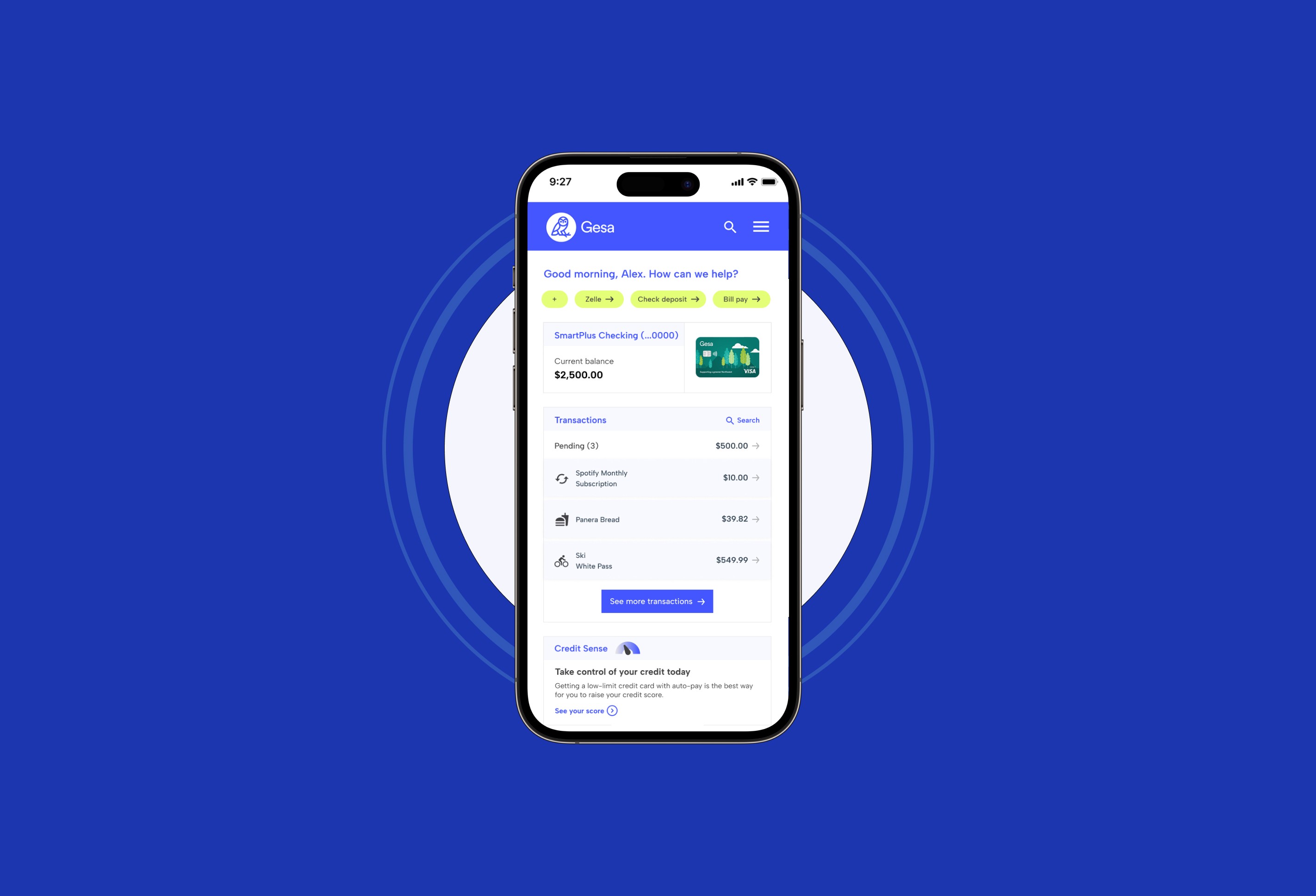
Gesa Single Product Dashboard
Driving end-to-end design for a mobile app's single card dashboard experience to ship a solution that reduced mobile app related call center volume by ~15%.
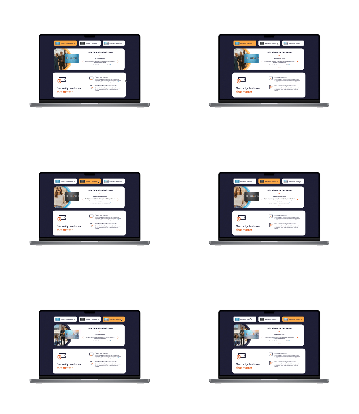
Discover Card Testimonials
Achieving a 6% conversion lift in card applications via a multi-card testimonials component + improving SEO ranking through increased user engagement.